Custom Layouts: Difference between revisions
More actions
HollowLeaf (talk | contribs) No edit summary |
HollowLeaf (talk | contribs) |
||
| Line 12: | Line 12: | ||
== Fixed Layout == | == Fixed Layout == | ||
[[File:CustomLayout-Fixed.png| | [[File:CustomLayout-Fixed.png|class=fullwidth|frameless|border|6000px]] | ||
The '''Fixed Layout''' uses a structured three-column design optimized for clarity and efficiency: | The '''Fixed Layout''' uses a structured three-column design optimized for clarity and efficiency: | ||
| Line 18: | Line 18: | ||
<ul style="list-style:none; padding-left:1.5em; margin:0;"> <li style="text-indent:-1.1em; padding-left:1.1em;"> <span style="display:inline-block; width:0.9em; text-align:center; font-weight:bold;">◦</span> <b>Left Column:</b> Contains the Chessboard and — depending on context — the <b>Repertoire Card</b> (Builder) or <b>Item Details</b> (Library). </li> <li style="text-indent:-1.1em; padding-left:1.1em;"> <span style="display:inline-block; width:0.9em; text-align:center; font-weight:bold;">◦</span> <b>Middle Column:</b> Displays the <b>Moves Card</b> for navigating and managing move sequences. </li> <li style="text-indent:-1.1em; padding-left:1.1em;"> <span style="display:inline-block; width:0.9em; text-align:center; font-weight:bold;">◦</span> <b>Right Column:</b> Contains your <b>Analytics Cards</b>. </li> </ul> | <ul style="list-style:none; padding-left:1.5em; margin:0;"> <li style="text-indent:-1.1em; padding-left:1.1em;"> <span style="display:inline-block; width:0.9em; text-align:center; font-weight:bold;">◦</span> <b>Left Column:</b> Contains the Chessboard and — depending on context — the <b>Repertoire Card</b> (Builder) or <b>Item Details</b> (Library). </li> <li style="text-indent:-1.1em; padding-left:1.1em;"> <span style="display:inline-block; width:0.9em; text-align:center; font-weight:bold;">◦</span> <b>Middle Column:</b> Displays the <b>Moves Card</b> for navigating and managing move sequences. </li> <li style="text-indent:-1.1em; padding-left:1.1em;"> <span style="display:inline-block; width:0.9em; text-align:center; font-weight:bold;">◦</span> <b>Right Column:</b> Contains your <b>Analytics Cards</b>. </li> </ul> | ||
At the bottom of the | At the bottom of the right column, you’ll find the <b>Enable Reordering</b> button, which allows you to drag and rearrange your Analytics Cards vertically to match your preferred workflow. | ||
== Flexible Layout == | == Flexible Layout == | ||
Revision as of 21:45, 13 October 2025
The Custom Layouts feature in the Repertoire Builder gives you control over how your workspace is organized. There are two layout modes available:
- ◦ Fixed: A static, three-column layout with predefined structure.
- ◦ Flexible: A fully customizable layout that gives you 100% control over how your cards are arranged (currently available for the Builder and Library).
This flexibility allows you to adapt the interface to your personal workflow — focusing on the cards and analytics that matter most to you. You can change your layout mode at any time through the Profile / Preferences dialog.
Note: You can override the layout mode manually by appending either ?layout=flexible or ?layout=fixed to the website URL.
This is particularly useful if you prefer a flexible layout on a large desktop monitor but want a fixed layout on your tablet.
Mobile devices always use the fixed layout for optimal performance.
Fixed Layout
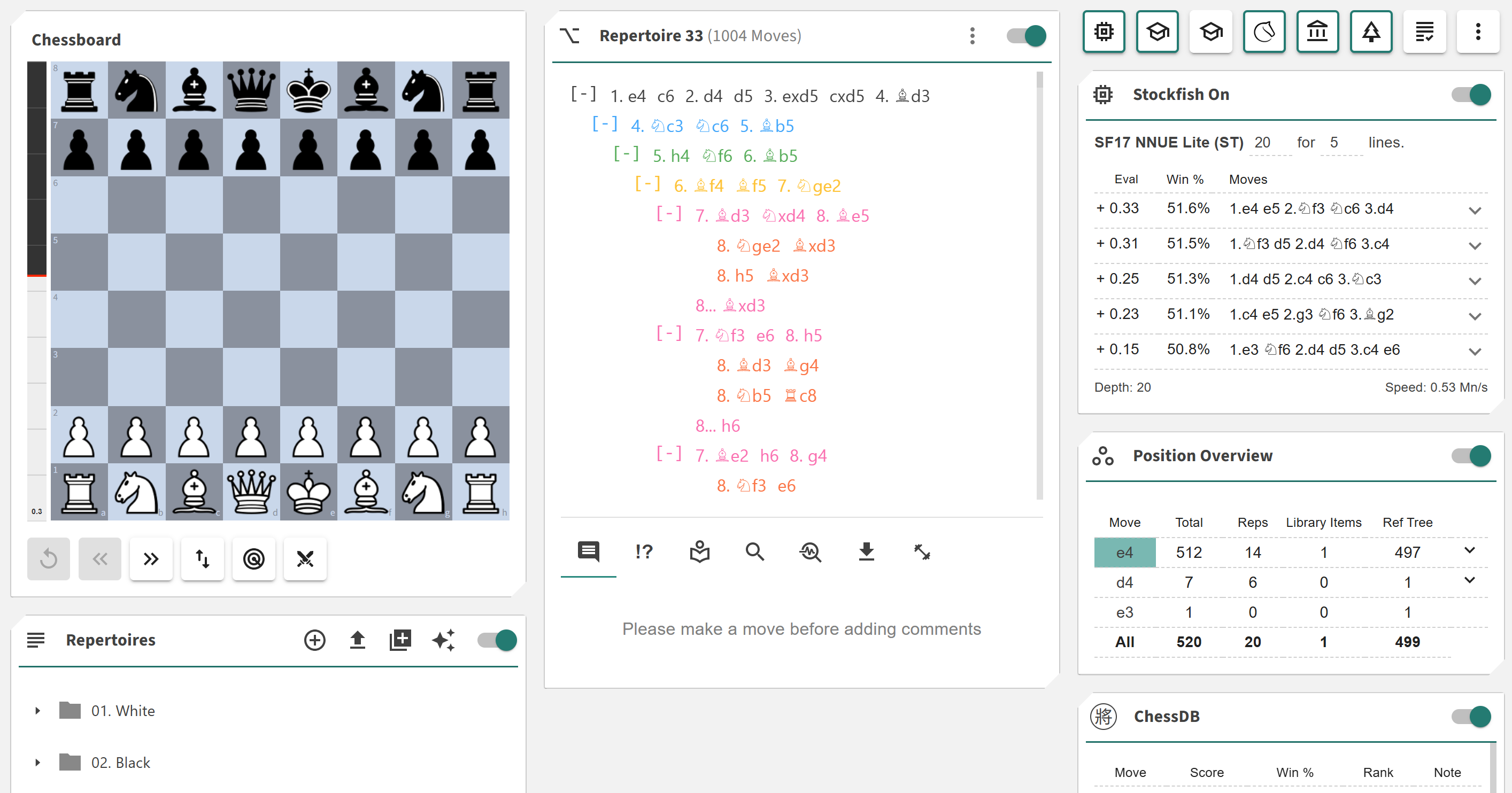
The Fixed Layout uses a structured three-column design optimized for clarity and efficiency:
- ◦ Left Column: Contains the Chessboard and — depending on context — the Repertoire Card (Builder) or Item Details (Library).
- ◦ Middle Column: Displays the Moves Card for navigating and managing move sequences.
- ◦ Right Column: Contains your Analytics Cards.
At the bottom of the right column, you’ll find the Enable Reordering button, which allows you to drag and rearrange your Analytics Cards vertically to match your preferred workflow.
Flexible Layout

The Flexible Layout provides a drag-and-drop workspace where you have complete control over card placement and sizing. It divides your interface into two main areas:
- ◦ Canvas: The main area where your active cards appear. You can drag cards by their header to reposition them and use the resize handles (top-left and bottom-right) to adjust their size.
- ◦ Palette: A panel on the right side that lists all available cards. Drag cards from the palette onto the canvas to add them, or drag cards from the canvas back to the palette to remove them.
The layout automatically adjusts based on your screen size and device, giving you full creative control on larger monitors while maintaining clarity on smaller displays.
Once you’ve customized your layout, you can click the green Speed Dial button in the bottom-left corner to save your current configuration as a .json file.
This lets you create and reload multiple layout presets depending on your study focus or workflow.
Note: A feature request has been made to support multiple saved layouts directly within the application — allowing users to switch between presets without needing to load from file.

